epymorph provides three output tools so you can quickly inspect a simulation output: line plots, choropleth maps, and data tables. To the extent possible, each of these tools uses similar interface concepts, primarily the axis strategies (select/group/aggregate) introduced in the previous chapter.
In this chapter we’ll dive deeper into the features of our three output tools.
First, let’s describe the design principles underlying these tools so you can best decide how they fit into your workflow. In the balancing act between simplicity and flexibility/power, we have prioritized “easy to learn” and “quick to use”, even if that somewhat limits “what you can do”. epymorph provides customization options we believe to be most commonly useful, but avoids esoteric or overly-complex options. For users that require maximal power and customization, the ultimate option is to utilize the output data directly with tools like matplotlib which offer much greater features at the expense of requiring more know-how and more lines of code to get results. epymorph’s tools do include some middle-ground features, however, that still leverage epymorph’s logic to do some heavy lifting while giving you more freedom in how to render the results – we’ll introduce those too.
Let’s start with a basic SIRS simulation, which we’ll use for all examples:
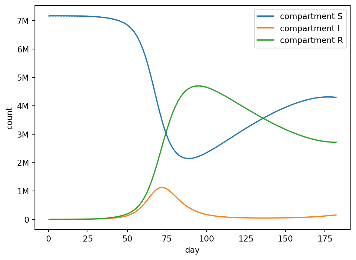
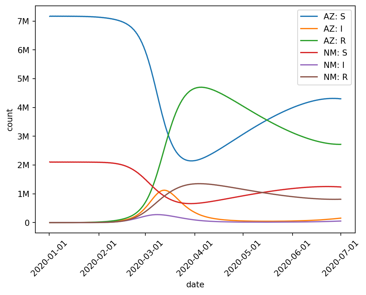
from epymorph.kit import*from epymorph.adrio import acs5, us_tiger# Our example RUME:# - an SIRS simulation,# - with movement based on distance,# - in Arizona and New Mexico counties,# - for 6 months in 2020.rume = SingleStrataRUME.build( ipm=ipm.SIRS(), mm=mm.Centroids(), init=init.SingleLocation(0, 100), scope=CountyScope.in_states(["AZ", "NM"], year=2020), time_frame=TimeFrame.rangex("2020-01-01", "2020-07-01"), params={"ipm::beta": 0.4,"ipm::gamma": 1/5,"ipm::xi": 1/90,"mm::phi": 40.0,"centroid": us_tiger.InternalPoint(),"population": acs5.Population(), },)# We'll be inspecting this simulation output:with sim_messaging(live=False): sim = BasicSimulator(rume) out = sim.run()
We’ve seen basic examples of line plot usage, but you can do some customization of the plot as well. (See also: the API documentation.)
Basic customization
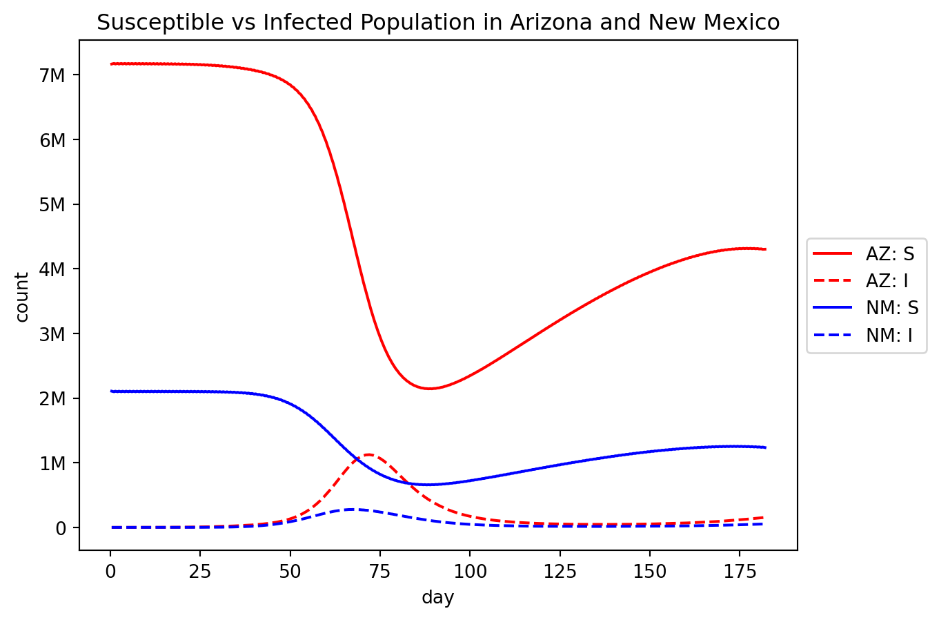
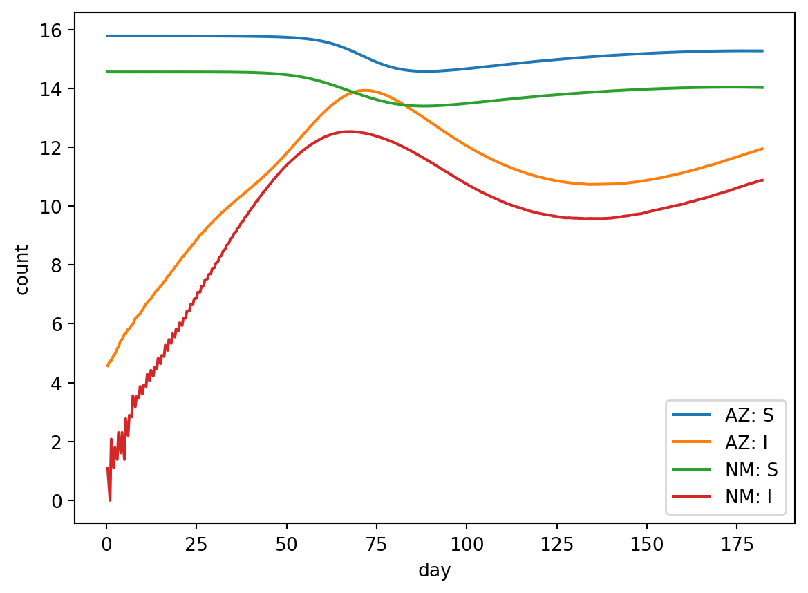
We can add some cosmetic touches (see code comments):
out.plot.line(# Start with the three axis strategies, as usual: geo=rume.scope.select.all().group("state").sum(), time=rume.time_frame.select.all(), quantity=rume.ipm.select.compartments("S", "I"),# Render the legend to the right of the plot: legend="outside",# Add a title: title="Susceptible vs Infected Population in Arizona and New Mexico",# Customize line styling: line_kwargs=[ {"color": "red", "linestyle": "solid"}, {"color": "red", "linestyle": "dashed"}, {"color": "blue", "linestyle": "solid"}, {"color": "blue", "linestyle": "dashed"}, ],)
legend and title are well-documented, but line_kwargs could use some additional explanation. Since we are using matplotlib behind the scenes to render plots, we wanted to surface some of its interface but without over-complicating things. line_kwargs is such a feature. If you were writing the matplotlib code yourself, you might call ax.plot(...) to render each line. Well basically so do we! Just about any option you can pass to ax.plot(...) can be provided using our line_kwargs mechanism.
If you know the order in which the lines will be drawn (which is the order they show up in the legend), then for each line you can specify a dictionary containing additional keyword arguments. (Above, I’ve drawn Arizona in red and New Mexico in blue, while drawing the Susceptible populations as solid lines and the Infected populations as dashed lines.) I knew I had four lines total here, so I provided a list of four dicts. But you can also give fewer dicts than you have lines – epymorph will simply cycle back to the start of the list if it has more lines to draw.
Of course you can get very clever with this if you’re familiar with Python list comprehensions. The following syntax would be equivalent to the above with less repetition:
line_kwargs=[ {"color": c, "linestyle": s}for c in ["red", "blue"]for s in ["solid", "dashed"]]
Aside from line styling, you can also change the default sort order; sorting by “location” (the default) or by “quantity”.
And change the formatting of the label. Label formatting strings allow you to use {n} for the geo node label and {q} for the quantity label. (The default formatting string is "{n}: {q}")
And finally you can change the formatting of the time axis: “auto”, “date”, or “day”. Date refers to the calendar date while day refers to the indexed simulation day – 0 is the first day of the simulation, 1 is the second day, and so on.
Note: the default time format (“auto”) is a bit tricky and can change depending on whether or not you have applied a grouping strategy to the time axis. Further, the value of time_format may be ignored if it isn’t valid for your grouping. For example if you group your results by epi week1, “date” or “day” formats are no longer applicable – epi week is its own format!
You may want to apply some sort of transformation to the data before you plot it. The transform parameter allows you to provide an arbitrary function that will be run on each line’s data after the axis strategies are applied but before it’s plotted.
For example, to plot the y-axis on the log scale:
from math import log, nandef log_transform(data_df):# we have to be careful to avoid log(0)! log_value = data_df["value"].apply(lambda x: log(x) if x >0else nan)return data_df.assign(value=log_value)out.plot.line( geo=rume.scope.select.all().group("state").sum(), time=rume.time_frame.select.all(), quantity=rume.ipm.select.compartments("S", "I"), transform=log_transform,)
The transform function will be passed a pandas.DataFrame containing columns “time” (the x-axis value), “geo” (the node ID), “quantity” (the label of the quantity), and “value” (the data column). The function is expected to return a DataFrame with the same columns and same number of rows, but where the “value” column’s values have been modified in some way. (Transformations outside of these limitations may not be supported.)
Note that the “geo” and “quantity” columns will contain the same value in every row – these are constant for a single line! They are provided only in case their values are useful to your transform function.
line_plt()
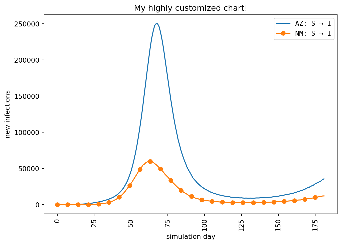
If you’re familiar with matplotlib or if you want more control over how the plot is drawn, you may prefer to work with the matplotlib interface directly. Naturally there’s nothing stopping you from doing that; the simulation results data is fully available to you. However it would be a lot of work re-implementing the logic that our axis strategies already provide. Thankfully you can have it both ways by using the alternative line_plt() method. (The “plt” in the name references the conventional import alias often used for matplotlib.)
line_plt() works a lot like line() – it accepts many of the same parameters, most importantly the three axis strategies – but you also pass in a matplotlib Axes object. epymorph will draw the lines and you get to do the rest.
import matplotlib.pyplot as plt# Create a figure:fig, ax = plt.subplots(layout="constrained")# Call line_plt() and pass in the axes to draw on:lines = out.plot.line_plt( ax, geo=rume.scope.select.all().group("state").sum(), time=rume.time_frame.select.all().group("day").agg(), quantity=rume.ipm.select.events("S->I"), time_format="day",)# I can use the returned Line2D objects:lines[1].set_marker("o")lines[1].set_markevery(7)# And do the other customary matplotlib things:plt.title("My highly customized chart!")plt.ylabel("new infections")plt.xlabel("simulation day")plt.xticks(rotation=90)plt.legend(prop={"family": "monospace"})plt.show()
The full power of matplotlib is at your fingertips once again.
Choropleth maps
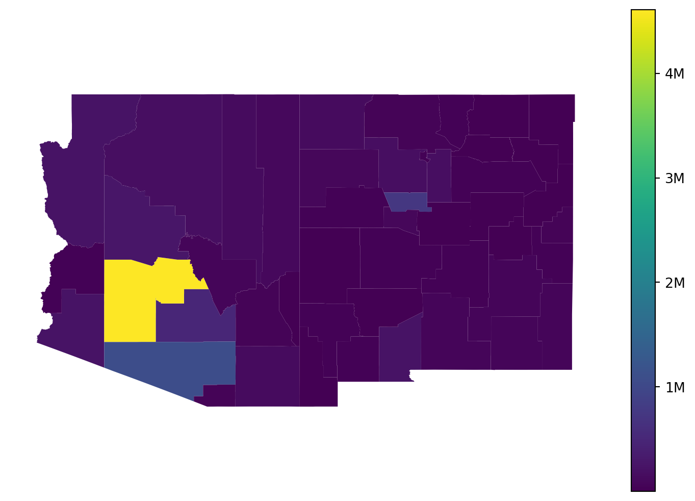
Since epymorph is all about spatially-explicit modeling, it’s natural to want to display data on a geographic map. The choropleth() method makes this very simple.
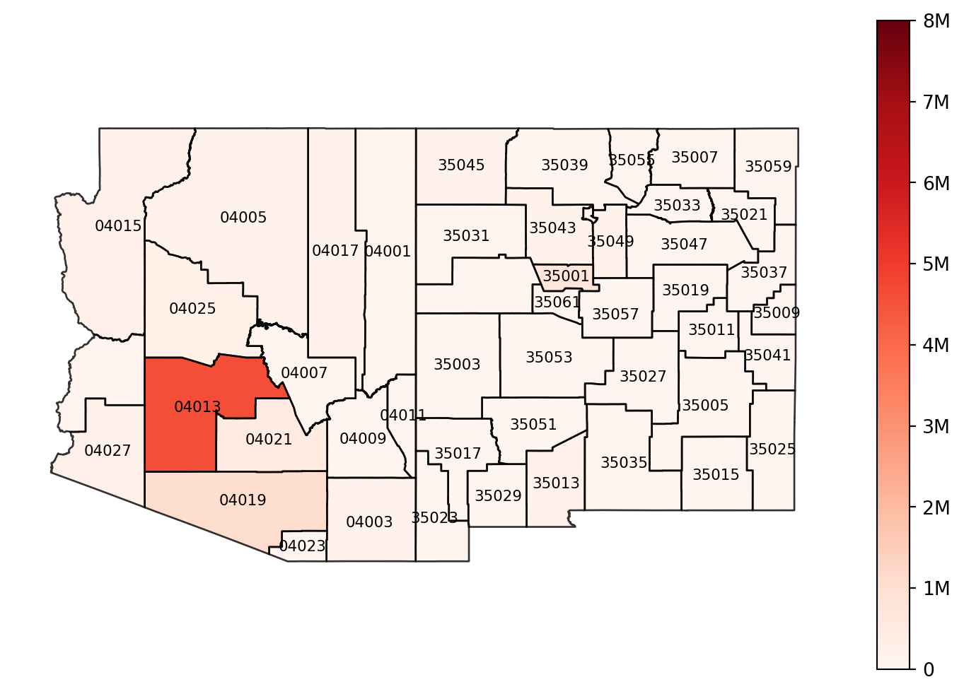
I’ve used axis strategies to show a county-granularity map, selecting the “S->I” event, and computing the sum across the entire simulated time frame. The only special constraint we have with choropleth maps is that we have to condense our data down to a single value per geographic node. Each polygon can only have one color! If we specify axis strategies that don’t produce suitable data, we’ll get an exception trying to render the map.
Basic customization
We can still do a bit of customization with this method:
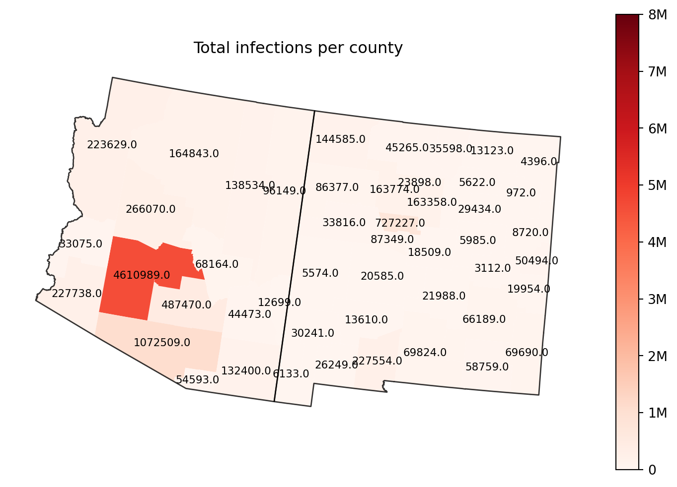
out.map.choropleth( geo=rume.scope.select.all(), time=rume.time_frame.select.all().agg(events="sum"), quantity=rume.ipm.select.events("S->I"),# Draw a title: title="Total infections per county",# Change the color map: cmap="Reds",# Set the min and max value for the color scale: vmin=0, vmax=8_000_000,# Draw borders around each state: borders=rume.scope.select.all().group("state"),# Label each polygon: text_label="black",# Change the map projection: proj="5070",)
title, cmap, vmin, and vmax act just like they do in matplotlib.
borders accepts a geo axis strategy, either a selection or a grouping; generally you’d also want to create this from RUME scope. Each node selected by the strategy will get a border (as long as we can load geography for the resulting scope).
text_label tries to render a label at the center of each geo node. If you pass a string naming a color, the label text is the data value drawn in that color. If you pass True, we’ll draw it in white. And if you want to customize the label further you can create a NodeLabelRenderer instance and pass that in.
proj lets us draw our map with a different projection. (See GeoPandas reference on projections to learn about the different kinds of values you can provide for this.) If not specified, epymorph uses a default projection as decided by the geo scope.
Advanced customization
NodeLabelRenderer
Here’s a quick example using NodeLabelRenderer to label each county with its FIPS code (but only if the FIPS code is an odd number).
from epymorph.tools.out_map import NodeLabelRendererclass MyLabels(NodeLabelRenderer):def labels(self, data_gdf):for geoid in data_gdf["geo"]: draw_label =int(geoid) %2!=0yield geoid if draw_label elseNoneout.map.choropleth( geo=rume.scope.select.all(), time=rume.time_frame.select.all().agg(events="sum"), quantity=rume.ipm.select.events("S->I"), borders=rume.scope.select.all(), cmap="Reds", vmin=0, vmax=8_000_000, text_label=MyLabels(color="black"),)
Transform
Just like with line() you can provide a transform function to modify the data. In this case, the function gets a DataFrame with just “geo” and “data” columns, but the principle is the same.
choropleth_plt()
As with line_plt(), there is also a choropleth_plt() method which accepts most of the same arguments in addition to an Axes object on which to draw the map polygons. This brings a lot of matplotlib’s flexibility back to you.
Geographic data
Additionally, we provide some functions that expose the underlying data munging that powers our choropleth maps. geography() will produce the geopandas.GeoDataFrame which corresponds to a geo selection:
By default, these methods return a pandas.DataFrame, however you can use the result_format parameter if you prefer to receive a string, or just to print the result directly.
geo quantity         0       0.25       0.5       0.75       1.0
 AZ        S 2134565.0 3028776.25 4144306.5 7008507.50 7173934.0
 AZ        I      98.0   45757.00   69060.0  197064.00 1122731.0
 AZ    S → I       6.0    3188.00    7039.0   18811.75  166021.0
 NM        S  641271.0  893873.25 1213028.0 1997171.50 2106200.0
 NM        I       2.0   14079.75   23137.0   65765.50  295067.0
 NM    S → I       0.0    1023.25    2349.0    6610.50   42534.0
# Show the sum of infection events in each state in February 2020.out.table.sum( geo=rume.scope.select.all().group("state").sum(), time=rume.time_frame.select.rangex("2020-02-01", "2020-03-01"), quantity=rume.ipm.select.events("S->I"),)
geo
quantity
sum
0
AZ
S → I
1060869
1
NM
S → I
651429
Because it’s not valid (or at least misleading) to sum compartment values over time, if your quantity selection includes compartments, those values will be omitted and you will receive a warning.
chart()
Although our line plot functions are the primary way to view time-series dynamics, for quick examination or in a limited environment (like a terminal) it may be handy to see a chart drawn in text. chart() does this.
geo quantity                 chart
 AZ        S ██████▇▅▃▃▃▃▄▄▄▅▅▅▅▅▅
 AZ        I ▁▁▁▁▁▂▅█▆▄▂▂▁▁▁▁▁▁▂▂▂
 AZ        R ▁▁▁▁▁▁▂▅▇███▇▇▆▆▆▅▅▅▅
 AZ    S → I ▁▁▁▁▁▂▅█▆▃▂▂▁▁▁▁▁▁▂▂▁
 AZ    I → R ▁▁▁▁▁▂▃▇█▅▃▂▂▁▁▁▁▁▂▂▁
 AZ    R → S ▁▁▁▁▁▁▂▃▆▇███▇▇▆▆▆▅▅▂
 NM        S █████▇▅▄▃▃▃▄▄▄▅▅▅▅▅▅▅
 NM        I ▁▁▁▁▂▅██▅▃▂▂▁▁▁▁▁▂▂▂▂
 NM        R ▁▁▁▁▁▂▄▆████▇▇▆▆▆▅▅▅▅
 NM    S → I ▁▁▁▁▂▄██▅▃▂▂▁▁▁▁▁▂▂▂▁
 NM    I → R ▁▁▁▁▂▃▆█▇▄▃▂▂▁▁▁▁▂▂▂▁
 NM    R → S ▁▁▁▁▁▂▃▅▇███▇▇▆▆▆▅▅▅▂
Note: the box characters for chart() might render strangely in some fonts and some contexts. Using the “print” format can help to avoid issues.
Footnotes
an epidemiological week is a standardized way to identify weeks of the calendar year, defined by the CDC.↩︎