You have constructed a RUME and used it to run a basic simulation. Congratulations! You are now the proud owner of one simulation result, contained in an Output object.
At this point you may wish to inspect the results to get an impression of how things went. If you were expecting your disease to spread but it in fact did not (perhaps due to parameter or model selection issues) the faster you can recognize that, the faster you can fix it.
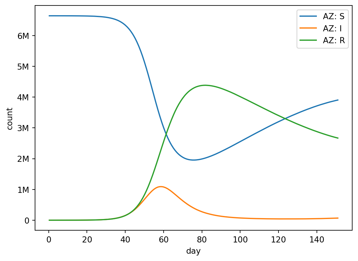
Here’s a quick example. We’ll use out.plot.line() to render a line plot from our results.
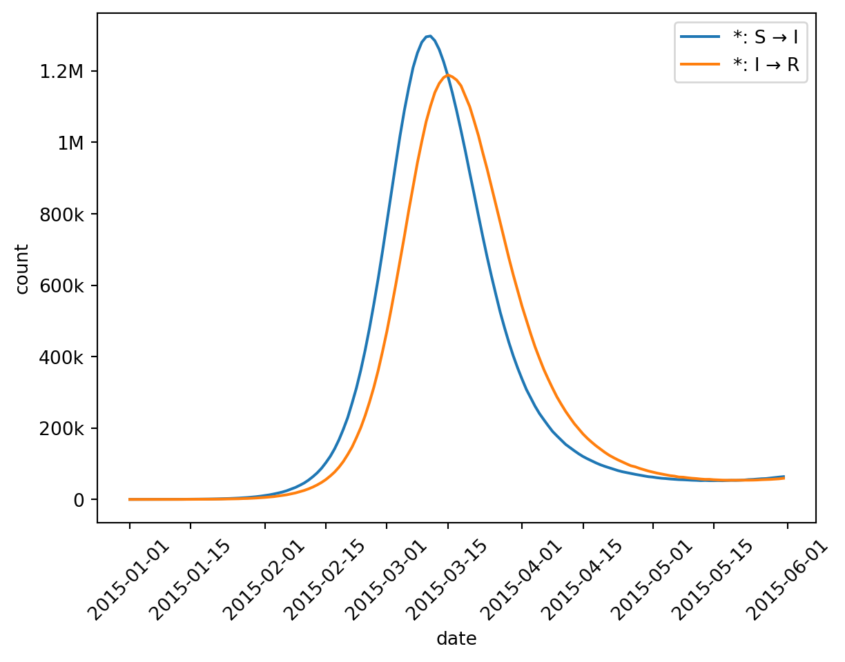
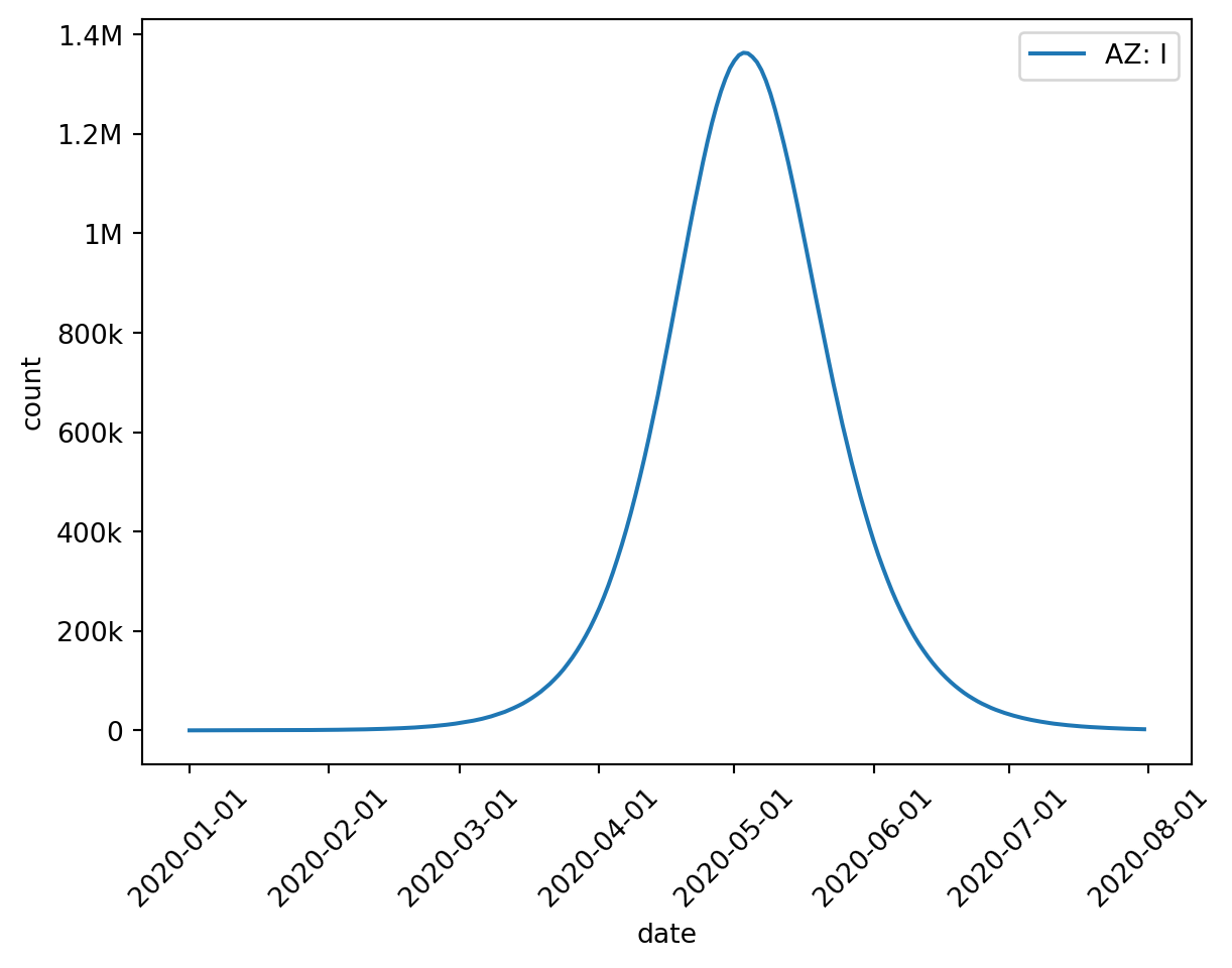
from epymorph.kit import*from epymorph.adrio import acs5, us_tiger# First construct a RUME to run:# - an SIRS simulation,# - with movement based on distance,# - in Arizona, New Mexico, Colorado, and Utah.rume = SingleStrataRUME.build( ipm=ipm.SIRS(), mm=mm.Centroids(), init=init.SingleLocation(0, 100), scope=StateScope.in_states(["AZ", "NM", "CO", "UT"], year=2015), time_frame=TimeFrame.rangex("2015-01-01", "2015-06-01"), params={"ipm::beta": 0.4,"ipm::gamma": 1/5,"ipm::xi": 1/90,"mm::phi": 40.0,"label": us_tiger.Name(),"centroid": us_tiger.InternalPoint(),"population": acs5.Population(), },)# Then run a basic simulation.with sim_messaging(live=False): sim = BasicSimulator(rume) out = sim.run()# And visualize the compartments time series in Arizonaout.plot.line( geo=rume.scope.select.by_state("AZ"), time=rume.time_frame.select.all(), quantity=rume.ipm.select.compartments(),)
Line plots are just the beginning. We can also display tabular data and draw choropleth maps, all using similar interface concepts.
The three result axes
Before we describe the options in detail, let’s get our heads around what a simulation result is. Running a spatially-explicit time-series simulation of a compartmental disease model means our output contains data in three axes – time, geography, and model compartments and events (or “quantity”, for short). Compartment data represents the count of individuals that are in a particular compartment at each point in time, while event data represents how many individuals transitioned between compartments at each point in time, and all of that is recorded for every geographic location (or node) in our simulation. So you can think of the output as a big cube.
It’s generally difficult for us to make sense of data when it’s shaped like a cube, though, so we will often want to inspect a selection (or slice) of the cube (for example, looking at the results for the month of May), or to squash the cube along one or more axes by aggregating it (for instance, finding the maximum number of infected individuals at any one time during the simulation) or by grouping and aggregating (for instance, summing together the results for all of the counties in a state). epymorph refers to these three modes – select, aggregate, and group-and-aggregate – as “axis strategies”.
The idea is that you get to decide how you would like deal with each of the three axes in turn. By analogy, we can focus our microscope on just the parts of the output we’re interested in. In practice, this means using epymorph’s objects to construct “queries” on the underlying data.
Geography
Since the RUME’s scope defines the geography for the simulation, we start with the scope when defining our geography strategy. The simplest strategy is to select all of our geography, exactly as it was defined in the RUME.
rume.scope.select.all()
The API is designed to construct queries by chaining together method calls and finally returning an object that describes your query. We started our selection using the select attribute of the scope, then chained a call to the all() method.
Selection
If instead we want to focus on a subset of the geography we simulated, replace all() with a different selection method. Our initial example takes advantage of the fact that we’re using US Census delineations (US states) to select a particular state of interest (Arizona). But we can select more than one (all of these are equivalent):
# select by namerume.scope.select.by_state("Arizona", "New Mexico")# select by postal coderume.scope.select.by_state("AZ", "NM")# select by FIPS code, aka GEOIDrume.scope.select.by_state("04", "35")
by_state() is a special method available when working with US Census geography. These next three are available on every kind of scope, but require you to know the identifiers used for nodes, or the order in which they’re specified.
# select by node ID (in CensusScope this is the same as GEOID)rume.scope.select.by_id("04", "35")# select by node index as determined by its ordering in the scoperume.scope.select.by_indices([0, 2])# select using a Python-like slice# if you had a list you could do: list_of_nodes[0::2]rume.scope.select.by_slice(0, None, 2)
Tip
We designed this interface to leverage your IDE’s code suggestion functionality to surface the available options. Try typing rume.scope.select. and then trigger suggestions (often with the Ctrl+Space or Command+Space hotkey).
Group and aggregate
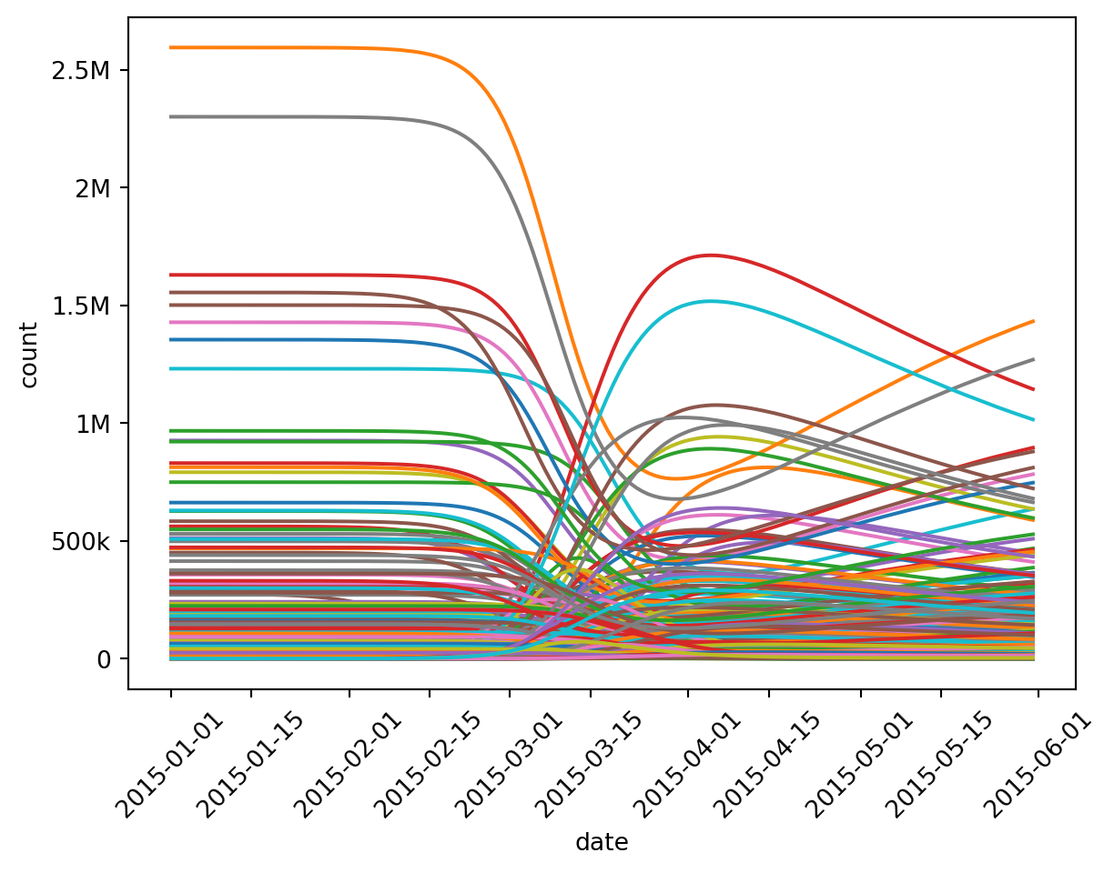
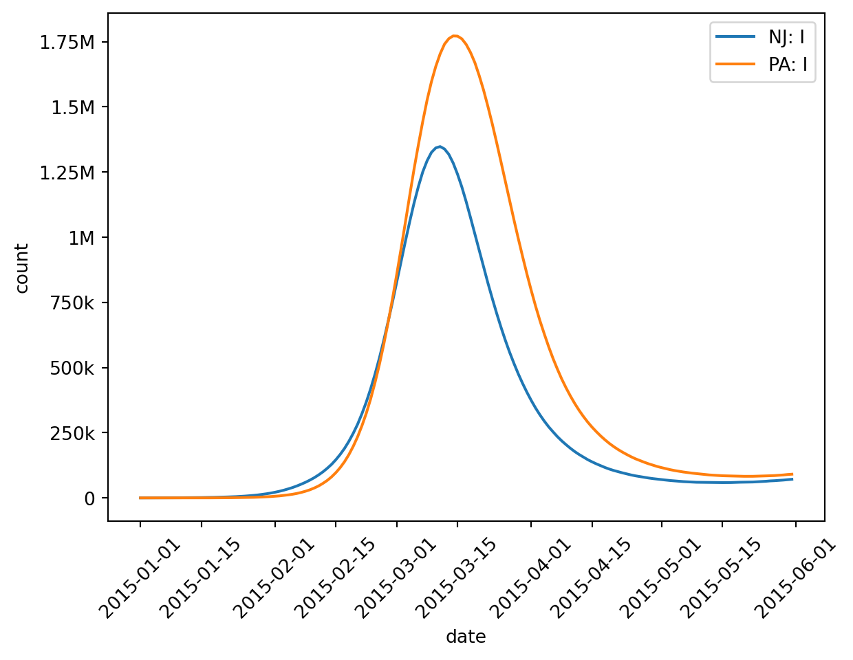
Simulating at US State granularity is often too coarse to draw interesting conclusions. Consider a simulation that uses the counties of New York, New Jersey, and Pennsylvania instead:
rume = SingleStrataRume.build( scope=CountyScope.in_states(["New York", "New Jersey", "Pennsylvania"], year=2015),# (assume all other RUME settings are the same as the previous example))# and then we'll run it -- code omitted for brevity
Wow, we have 150 counties of output to deal with! That’s way too much noise. epymorph even gives up trying to draw the legend for this many lines. There are two strategies for dealing with this: select a few of the lines and/or group some of these lines together and display a summary (aggregate).
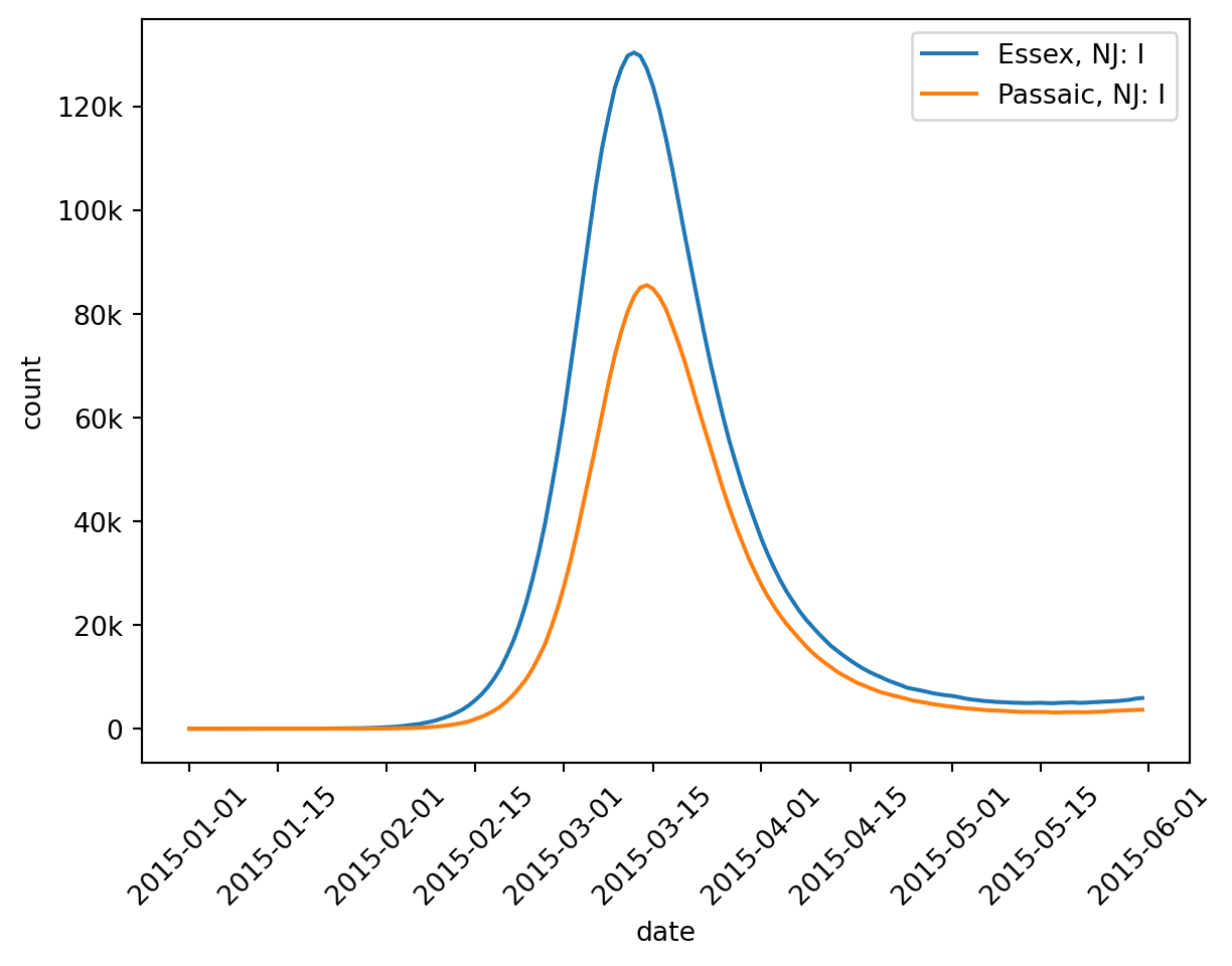
Let’s see what happens with the number of Infected individuals in Passaic and Essex counties, for starters.
The only thing new here is since we’re using a county scope, we can select either by_county() (select the named counties) or by_state() (select all counties in the named states).
But it might also be interesting to get a state-level overview. Imagine grouping the counties by the state they belong to and summing up their compartment values over time. Even though we’re simulating a finer granularity, we may want to inspect our results at a coarser summary granularity. epymorph makes this easy.
In this case, I started with a typical selection (rume.scope.select.all()) but then chained on a grouping operation (group("state")), followed by an aggregation operation (sum()).
Math note
Summing county-level results together makes sense.
If one county has 20 infected individuals (the I compartment) on a certain day, and another county has 10 infected individuals on that same day, then together they had 30 infected individuals.
By the same logic, if 12 people recovered from the disease in one county (the I → R event) while in the other county 6 people recovered, together they had 18 people recover.
This may seem obvious, but later we’ll see cases where aggregation does not make sense. It’s important to keep in mind what these numbers represent in real world terms!
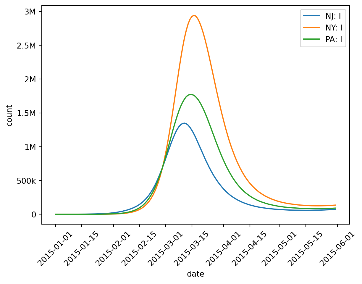
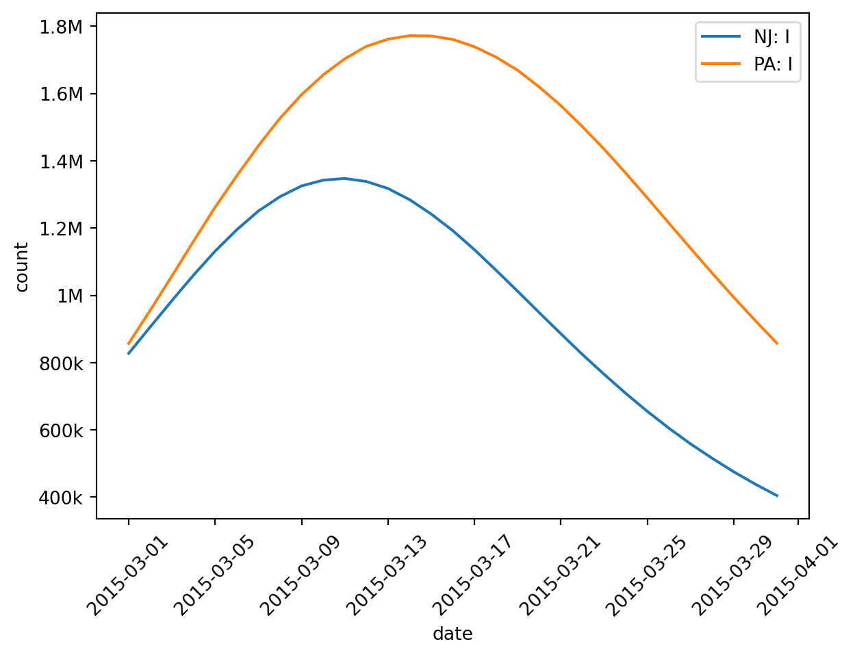
New York is such a populous state that it could swamp the other two and make comparison difficult. Thankfully we can select and group-and-aggregate at the same time. Let’s focus just on Pennsylvania and New Jersey.
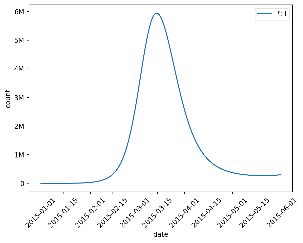
You can also omit the group statement when performing an aggregation. This implies that all nodes belong to the same group, effectively collapsing the geography axis down to a single value (which you’ll see gets the label “*” by default).
The geo parameter accepts GeoSelection objects as well as GeoAggregation objects; this tells us that not only can we subselect the geography, we can also aggregate or group-and-aggregate the geography. Both are subclasses of GeoStrategy. Each visualization tool may support different types of strategy, depending on what it’s doing.
If you examine the type returned by calling rume.scope.select.all() (or glance at its tool tip) we’d see it returns a GeoSelection object. That’s how we know it’s a valid option.
Time
For the time axis strategy, we start our selection from the RUME’s time frame. We’ve already seen rume.time_frame.select.all() to view the whole time frame.
Selection
In our example, the peak of infection happens around March, so let’s zoom in.
Replacing all() with rangex() (short for “endpoint-exclusive date range”) we can narrow our view. There’s also range() if you prefer endpoint-inclusive ranges. Both accept dates as ISO-8601 strings or Python date objects. Note that we have to select a date range which is a subset of our simulation time frame. If we tried to select something in 1999 for example, epymorph will raise an exception.
Other time selection options include year() and by_slice().
(TODO: talk about selection by tau step)
Group and aggregate
And of course we can group and aggregate along the time axis as well. For example, to show a weekly total:
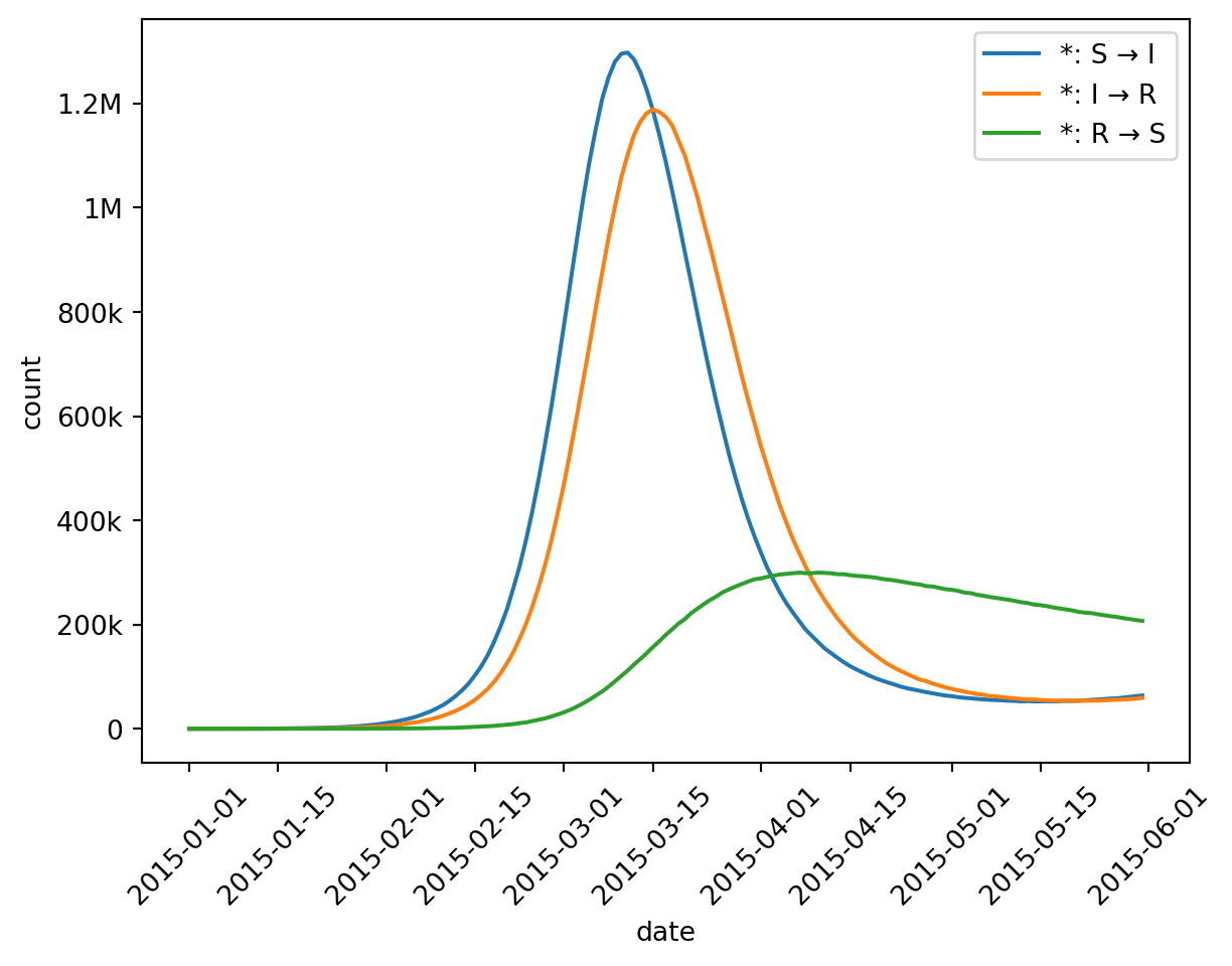
from epymorph.time import ByWeekout.plot.line( geo=rume.scope.select.by_state("NJ", "PA").group("state").sum(), time=rume.time_frame.select.all().group(ByWeek(start_of_week=6)).agg(), quantity=rume.ipm.select.compartments("I"),)
The group() call is a little different in this example: we provided an object instead of a string to describe how to group the time axis. ByWeek implements logic to group by calendar week where we get to configure which day starts the week (6 is Sunday, using Python’s convention for identifying days of the week from the datetime library). The ByWeek class extends the TimeGrouping abstract class, and the group() method accepts any TimeGrouping object. This implies you can write your own implementation to do custom grouping logic. However if you don’t have specialized grouping needs, group("week") also works. (Don’t forget auto-complete suggestions are here to help!)
You may also wonder why we call agg() for the time axis, as compared to sum() for the geo axis. On one hand, sum() is short for agg("sum"), so we could use that for the geo axis instead. However we can’t call sum() for the time axis: for time we need not just one aggregation method but two. One to aggregate compartment values over time, and one for event values over time. By default, agg() implies the “last” operation for compartments and the “sum” operation for events. But you can override this for your needs, for example agg(compartments="max", events="max") if you wanted to compute the maximum seen in each time group.
Math note
Why do we need different aggregation methods for compartments and events when aggregating across time? Like our last math note, we have to reason about what these quantities represent in real terms.
Events represent the number of occurrences within a given time period. If 10 events happen every day for a week, it makes sense to say that 70 events happened that week (the sum).
Compartments, on the other hand, are point-in-time counts of how many individuals are in a given state. If I take a count every day for a week and each day I see 10 people, I cannot say there were 70 unique people – I might have counted someone more than once! Instead it might be reasonable to report the final count (last) as the weekly value.
This is why “sum” is our default for aggregating events over time, but “last” is our default for aggregating compartments over time. You can choose to sum compartment values over time if you like, but understand that you are computing something that doesn’t have a simple meaning in physical reality.
Once again we can also omit grouping (e.g., rume.time_frame.select.all().agg()), in order to collapse the time axis down to a single value. This wouldn’t make for a very interesting line plot, but can be useful with other visualization tools!
Quantity
A quantity axis strategy – which includes all of the compartments and transition events from our disease model – starts from the IPM. Naturally rume.ipm.select.all() is there to show everything (although you may find it difficult to visualize compartment and event counts on the same y-axis).
Selection
Methods compartments() and events() will narrow down the selection:
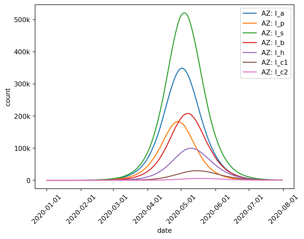
To see some more advanced selection features, though, we should switch to a more complex IPM. And for simplicity, we’ll switch to a single-geo-node simulation.
This SPARSEMOD model (developed to model COVID-19) has compartments for Susceptible (S), Exposed (E), Infected Asymptomatic (I_a), Infected Presymptomatic (I_p), Infected Symptomatic (I_s), Infected on Bed-Rest (I_b), Infected Hospitalized (I_h), Infected in ICU (I_c1), Infected in ICU Step-down Unit (I_c2), Deceased (D), and Recovered (R).
That’s a lot of compartments and events to inspect! epymorph lets you use wildcard characters (asterisks) when selecting compartment and event names to make working with complex models less tedious.
For example: let’s plot all of the Infected compartments at once.
The asterisk matches any number of characters (including zero characters) so I* will match I_a and I_c1 but not S, etc. If we wrote I*1 that would match only I_c1 in this example, but would match I_1 if there were such a compartment.
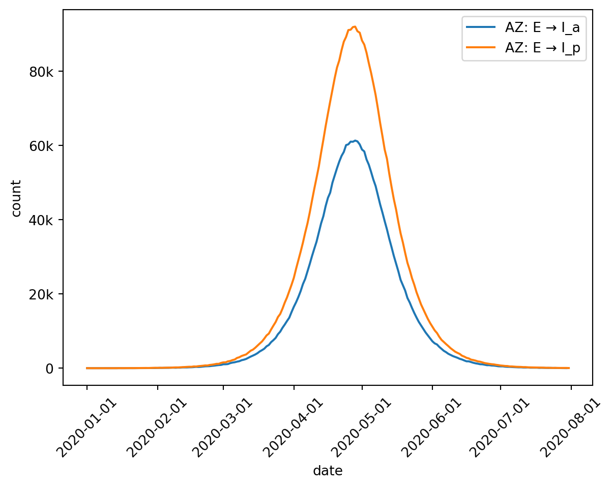
A similar syntax works for events. Events are transitions from one compartment and to another one, so you need to specify two names with a separator in between. (For seperators we accept ->, -, or > just to be flexible.)
For example, this is one way we can select both of the transitions leaving the Exposed state:
There’s another selector method that allows you to choose both compartments and events by providing a list of names (which may contain wildcards) for each: ipm.select.by(compartments=["S", "I"], events=["S->I"]) for example. We suspect that the need for this is pretty rare, however it’s worth mentioning.
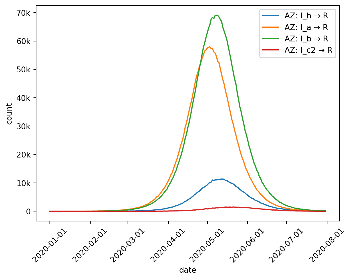
Group and aggregate
Of course we may want to group and aggregate these as well. There are a few special rules determining which compartments will be grouped together (and thus events as well) which are based on compartment naming conventions.
Compartment names can be separated into parts using underscores, which you can think of as subscript notation in scientific literature (this is borrowed from LaTeX syntax: I_a is rendered as \(I_a\)). So compartments I_a and I_p share the same “base” name (I) but have different subscripts (a and p). In case a name contains multiple underscores (I_a_b_c_d) epymorph interprets everything after the first underscore as the subscript (a_b_c_d).
By default (calling .group()), epymorph assumes that only exact matches should be grouped – i.e., event E->I_a would only be grouped with another event named E->I_a (this sort of thing typically only happens in multistrata IPMs). Event E->I_p would be in a different group.
If you want to combine compartments that have the same base name regardless of subscript you can enable grouping across subscript (.group(subscript=True)), in which case events E->I_a and E->I_p would be grouped. There’s also an option to enable grouping across strata, but we’ll cover multistrata models in full detail another time.
You may wish to take these naming conventions into account when writing your own IPMs.
Here’s the total number of individuals in any Infected state:
So far we’ve focused only on line plots, but these are not the only visualizations available in epymorph. Now that we know the basics of selectors, we can apply this knowledge to other visualization tools as well. We’ll also see some advanced options of the line plots tool.