# import the necessary libraries
import matplotlib.pyplot as plt
import numpy as np
from sympy import Max

from epymorph.kit import *
from epymorph.adrio import acs5Introductory usage of epymorph
SCENARIO:
Welcome to epymorph! Let’s jump into the basics of using epymorph by building a simple model for a basic scenario.
Imagine that you are investigating the dynamics of measles transmission in the children of a single US County. For simplicity, we’ll assume that the population of children within the county is mixed homogenously and all children are susceptible (i.e., a naive population). Suppose we are investigating Mohave County in Arizona.
Exercise 1
Build a simple Susceptible-Infectious-Recovered (SIR) model for a single population. Once you recover from measles, you are typically immune for life. Thus, a simple SIR model provides a suitable basis for modeling this case study.
class Sir(CompartmentModel):
    """Defines a compartmental IPM for a generic SIR model."""
    compartments = [
        compartment('S'),
        compartment('I'),
        compartment('R'),
    ]

    requirements = [
        AttributeDef('beta', type=float, shape=Shapes.TxN,
                     comment='infectivity'),
        AttributeDef('gamma', type=float, shape=Shapes.TxN,
                     comment='recovery rate'),
    ]

    def edges(self, symbols):
        [S, I, R] = symbols.all_compartments
        [β, γ] = symbols.all_requirements

        N = Max(1, S + I + R)

        return [
            edge(S, I, rate=β * S * I / N),
            edge(I, R, rate=γ * I),
        ]

my_ipm = Sir()scope = CountyScope.in_counties(["Mohave, AZ"], year=2020)null_mm = mm.No()my_init = init.SingleLocation(location=0, seed_size=5)time = TimeFrame.of("2020-01-01", duration_days=200)Now we can set up the RUME for this exercise. - To do this, you will need to specify the ‘population’ that is required by the IPM. Use the CensusAdrio to specify populations in the age range of children (0 - 9 years old) - Use the following values for the required parameters. - beta = 0.4 - gamma = 1/4
minage = 0
maxage = 9
pop = acs5.PopulationByAge(minage, maxage)
age = acs5.PopulationByAgeTable()beta = 0.4
gam = 1 / 4# create the simulation
rume = SingleStrataRUME.build(
scope=scope,
ipm=my_ipm,
mm=null_mm,
init=my_init,
time_frame=time,
params={
"beta": beta,
"gamma": gam,
"population": pop,
"population_by_age_table": age,
},
)
sim = BasicSimulator(rume)
# here you may add the live = False to make the results look cleaner
with sim_messaging(live= False):
out = sim.run(
rng_factory=default_rng(5),
)Loading gpm:all::init::population_by_age_table (epymorph.adrio.acs5.PopulationByAgeTable):
|####################| 100% (0.873s)
Running simulation (BasicSimulator):
• 2020-01-01 to 2020-07-18 (200 days)
• 1 geo nodes
|####################| 100%
Runtime: 0.043srume.ipm.diagram()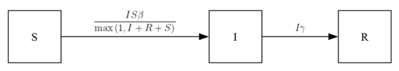
out.table.sum(
    geo=out.rume.scope.select.all(),
    time=out.rume.time_frame.select.all(),
    quantity=out.rume.ipm.select.events(),
)| geo | quantity | sum | |
|---|---|---|---|
| 0 | Mohave, AZ | S → I | 12237 |
| 1 | Mohave, AZ | I → R | 12242 |
out.table.quantiles(
    quantiles=[0, 0.5, 1.0],
    geo=out.rume.scope.select.all(),
    time=out.rume.time_frame.select.all(),
    quantity=out.rume.ipm.select.compartments(),
)| geo | quantity | 0 | 0.5 | 1.0 | |
|---|---|---|---|---|---|
| 0 | Mohave, AZ | S | 6152.0 | 6154.0 | 18386.0 |
| 1 | Mohave, AZ | I | 0.0 | 9.0 | 1643.0 |
| 2 | Mohave, AZ | R | 0.0 | 12227.5 | 12242.0 |
Exercise 2
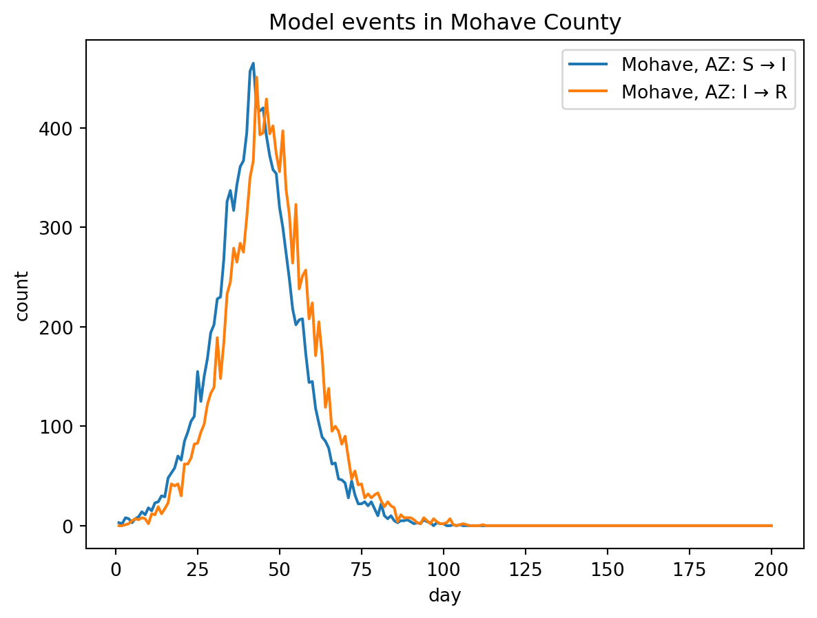
In textual terms, the output of a model is just a large array detailing the number of individuals in each model compartment over time, as well as the number of specific events that occur over time. To better represent these data, we usually want to view the model outputs graphically, i.e., as a graph of each compartment over time.
out.plot.line(
    geo=out.rume.scope.select.all(),
    time=out.rume.time_frame.select.all(),
    quantity=out.rume.ipm.select.compartments(),
    title="Compartment values in Mohave County",
)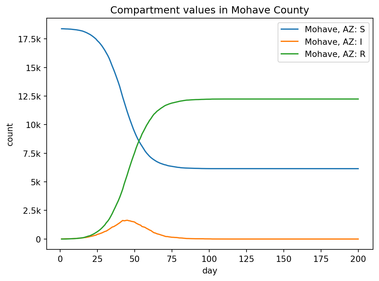
out.plot.line(
    geo=out.rume.scope.select.all(),
    time=out.rume.time_frame.select.all(),
    quantity=out.rume.ipm.select.events(),
    title="Model events in Mohave County",
)
Exercise 3
An important feature of all epymorph models is that they are stochastic, meaning that at each time step, a draw from a probability distribution determines which and how many transitions between model compartments (called “events”) occur. Thus, to get an accurate picture of the likely infections dynamics, one usually runs the model many times (called “realizations”); all of these runs are shown on the output graph, with the average of them highlighted and shown to show the most likely overall pattern.
stored_sim_results = []
length = 20
for x in range(length):
    out = sim.run()
stored_sim_results.append(out)fig, ax = plt.subplots()
# This uses the more advanced line_plt() functionality
for j in stored_sim_results:
j.plot.line_plt(
ax = ax,
geo=j.rume.scope.select.all(),
time=j.rume.time_frame.select.all(),
quantity=j.rume.ipm.select.events("S->I"),
)
ax.set_xlabel("day")
ax.set_ylabel("S->I Events")
ax.set_title("Graph of 100 Simulation Results")
ax.grid(True)
fig.tight_layout()
plt.show()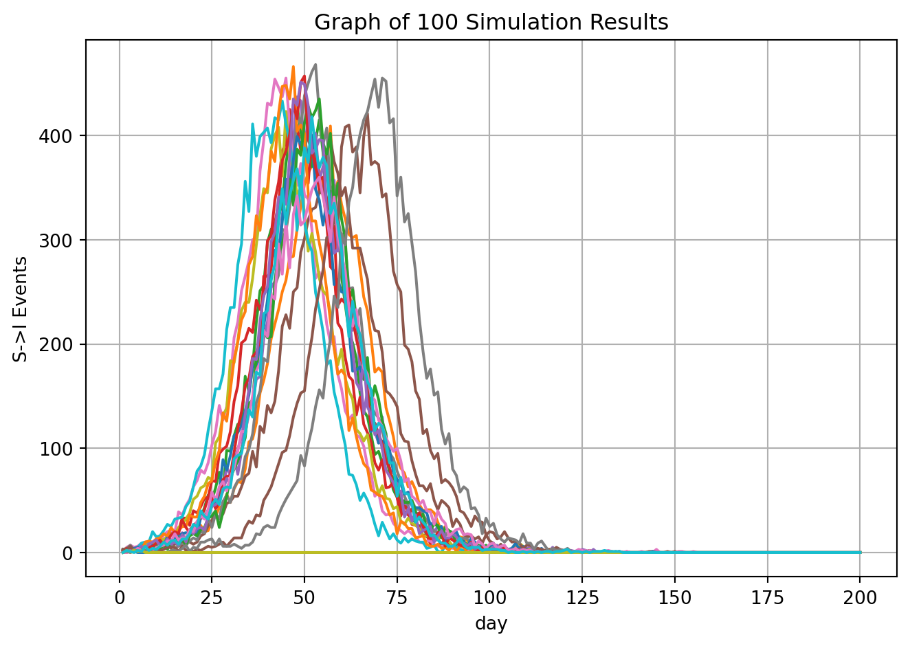
Exercise 4
ADVANCED Now that we have the basic model up and running, let’s use it to explore various disease dynamics in more detail.Because infected individuals are immune to measles after they recover, diseases like measles exhibit a disease “burnout”, where the infection rate drops to zero as the number of available susceptible individuals drops.
beta_array = [0.33, 0.45, 0.8]
transmission_rates = []
for b in beta_array:
    rume = SingleStrataRUME.build(
        ipm=my_ipm,
        mm=null_mm,
        init=my_init,
        scope=scope,
        time_frame=time,
        params={
            "beta": b,
            "gamma": gam,
            "population": pop,
            "population_by_age_table": age,
        },
    )
    sim = BasicSimulator(rume)
    out = sim.run(
        rng_factory=default_rng(5),
    )

transmission_rates.append(out)fig, ax = plt.subplots()
for j in transmission_rates:
j.plot.line_plt(
ax = ax,
geo=j.rume.scope.select.all(),
time=j.rume.time_frame.select.all(),
quantity=j.rume.ipm.select.compartments("I"),
)
# custom graph
ax.set_xlabel("days")
ax.set_ylabel("Infected")
ax.set_title("Burnout")
ax.grid(True)
fig.tight_layout()
plt.show()
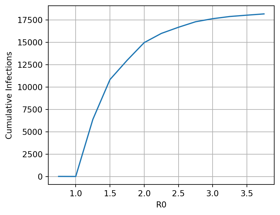
The basic reproductive number of the pathogen (\(R0\)) in the SIR model is represented mathematically as the ratio of transmission rate to recovery rate: \(\beta / \gamma\). Iteratively alter the \(R0\) from ~0.01 to 10 and create a line plot to show how \(R0\) is associated with the total number of individuals that ultimately become infected during the outbreak. This number can be extracted as the number of Recovered individuals present at the last time step of the simulation, because remember that all Recovered individuals in this SIR model had been infected sometime in the past.
Here the code is creating a simulation with different basic reproductive numbers of the pathogen for 6 different simulations and these R0 vals are being used to calculate a different beta val for each simulation. Total_outputs is storing the infections for each simulation.
total_outputs = []

R0_vals = np.arange(0.75, 4.0, 0.25)
beta_array = [x * gam for x in R0_vals]

for b in beta_array:
    rume = SingleStrataRUME.build(
        ipm=my_ipm,
        mm=null_mm,
        init=my_init,
        scope=scope,
        time_frame=time,
        params={
            "beta": b,
            "gamma": gam,
            "population": pop,
            "population_by_age_table": age,
        },
    )
    # run new sim here
    sim = BasicSimulator(rume)
    out = sim.run(
        rng_factory=default_rng(8),
    )

    # sum the I->R events over time to get cumulative
    current_output = out.table.sum(
        geo=rume.scope.select.all(),
        time=rume.time_frame.select.all(),
        quantity=rume.ipm.select.events("I->R"),
    )

    # Extract the sum column from the data frame
    total_outputs.append(current_output['sum'][0])
Now we plot the cumulative infections versus \(R0\). Note that the stochasticity will create a pattern that is close to the theoretical expectation, but not exactly.
plt.figure(figsize=(5, 4))
plt.plot(R0_vals, total_outputs)
plt.xlabel("R0")
plt.ylabel("Cumulative Infections")
plt.grid(True)
plt.show()